card camp recap.

it's been almost a week since our annual card making retreat and i am struggling to get into routine again. this year seamed so different and tiring - although i enjoyed it. things change every year and some for the good and others not. this year we had loads (90%) new girls attending camp. what this tells me is that the regulars are struggling and finding it hard to budget for camp which was also visible in sales. it may only be my observation but one none the less. every year i make a something special as my project - other than a card that is. BUT this year even i opted for a card which meant that i actually stuck to some sort of budget. and although there seemed to be some disappointed ladies everyone loved the cards too.
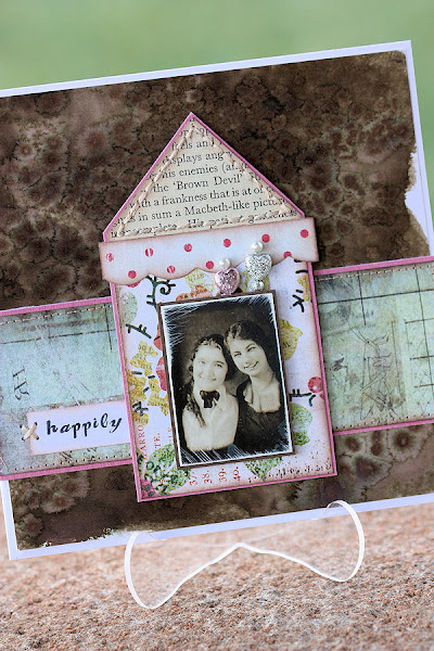
we did some funky backgrounds using distress stains. easily one of my favourite products to be released this year. although an old technique, out of 75 ladies only 1 had done this technique before and not with this new product or on paper. so all in all a good 2 days of informative teaching to a bunch of eager learners. today i am sharing the card samples with you as i prepare the step x step photos which i hope to share tomorrow God willing.
card sample 1 and a close-up pic of the ribbon we coloured using distress stains. i am such a snob when it comes to ribbon - so for me to use ribbon on a project it has to be silk at the very least. the colour and texture you can achieve is simply amazing.
card sample number 2 - same technique but different colouring.
the effects is simply amazing and even better in real life than in the photos.
thanks for popping in. stop by tomorrow for the technique sxs and some more samples of using distress stains on your cards and layout.

play.

so the lovely Natalie from Punky Scraps designed one of the layouts for Scrapbook Challenges' Sizzling summer of sketches. we basically created sketches for an entire month and hosted the challenges for members to play along. Natalie is eccentric OK! she is a breath of fresh air and her layouts must come so naturally - like a fresh spring breeze. so for her SS11 challenge this is what i came up with! i love it - i really do feel more comfortable with throwing paint at a canvas - and i don't do it enough - it's not really socially acceptable you know. just as my life i am a rebel by nature and when everyone goes left i will go right - it's what i do you see. so forgive me for stepping on toes. but life really is too short not to have fun in this comedy we call life. head on over to scrapbook challenges and look for Natalie's challenge...and play along - you'll love it.
i used mostly stuff i had on my table. i always seem to do that - maybe because my table is always full of stuff. it's actually funny at times - but i guess it means i am keeping busy which is a good thing.
the green circle is a little something i am working on for an American publication - so watch this space. maybe i will share it once it has been published - or force you to buy the book.
supplies
patterned paper - basic grey for hero arts *out of print* (too die for)
card stock - bazzill basics
stamps - stampington, stampers anonymous, paperbag studios
black paint - ranger paint dabbers
distress stains - ranger industries
journaling strips by karen foster
buttons, thread, diamante

altered canvas trio.

a while ago i made this set of 3 mixed media canvasses. i loved how they turned out...i guess no one else did but that's another story. but i thought i would share them here as we are about to set out on another mixed media canvas journey. a couple of really awesome friends and i are getting together to play. there's so much enthusiasm amongst them and i can just see the gorgeous art works that will come from a morning of play. this is a picture of the 3 grouped together -not sure i have space on my walls for them though.
blue - is covered in dressmaking pattern sheet and then layers of blues and gold from Ranger's paint dabber group. the multi functional empty bird-cage by tim holtz takes centre stage. and don't you just love that stamp...my heart has wings!
purple - so not my favourite colour but nice. a tim holtz grungeboard bird negative becomes the perfect stencil to be gold leafed. the bird sits above a strip of sheet music covered in bee's wax and nails. yes life is filled with people who sing beautiful tunes in front of you but given half a chance they bring out the nails...i have learned that the human tongue is a terribly hurtful thing.

i found a whole jar filled with these rusty old nails in our shed on the farm - i love their rusty vulnerability
pink - oh so pretty. covered in pink and gold paint with a bee's wax envelope that carries my hopes, dreams, fears and sadness in life itself.
the wax envelopes consists of several layers of patterned papers and then dipped into wax for that stunning glassy see through look.
i hope you like what you see. here's to creative play and being free!

scrapbookchallenges.

another week means another sketch (258) over at scrapbook challenges. for this layout i used some of the new pink paislee papers. i love how the colour scheme turned out so bright and funky! the black and white photos really pop out from the background colours used.
these funky little flowers were coloured using the new distress stains. the flowers were cut using my Slice Elite in plain card stock. the center of the flower is a 7gypsies sticker.
these little tags are some left-overs from a kit. the beautiful rub-on (orange plat like thingy) is by Hambly. you gotta love those rub-ons - such awesome quality!
the word 'wonder' was also cut out with my Slice machine in a pale blue bazzill card stock. i then used my distress stains and added some more colour to match my flower. i love these little bottles of ink - so versatile and handy! there's a design call out over at Scrapbook Challenges - so head on over if you are interested!

alcohol inks.

today's alcohol ink class was absolutely amazing! the girls did stunning work. some opted for making a set of 9 tags while some did the most amazing canvas projects - i love how more than often the students take your idea and turn it into a work of art! the best part of my job! here's what my canvas looks like. in total we did about 12 altered pieces with alcohol inks on the canvas alone...a bit more on the tags! they include brads, beads, tin foil, metal photo corners, diamante, photo paper, tim holtz metal goodies, fragments and giant playing cards. if you feel inspired let me know, and please remember if you copy the project for your own benefit please do so and give credit where it is due! keep handmade art alive! have a wonderful Sunday!

Popular Posts

Like us on Facebook

Flickr Images